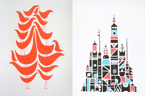
For each of the 5 elements of design (shape, line, texture, space, value), find an example that utilizes each element within the design (Google search for poster design, advertisements, etc). You should have 5 DIFFERENT sample designs.
For each, evaluate the design in 4 to 5 sentences. Label each with the appropriate element. Then, discuss how that particular element is used and how it enhances the design.

SHAPE:
This shows shape because all of the curved lines put together create an image, and there are different lines and curved lines that make up something also. The curved line make up small birds that are somewhat abstract. In the other picture, the small shapes make up a little town full of buildings.

LINE:
In this image it is basically all lines. Some of them are vertical and some are horizontal which make it more interesting to look at. If they were all horizontal or all vertical it would be boring. The lines also makes some sort of illusion when you really look at it. I like that fact that they aren't all perfectly straight lines and somewhat curved.

VALUE:
In this photo the value shows parts of the image that are light in dark. He is a soldier and the darker shading makes the image more interesting because its a dark photo about war. They used light and dark value in this painting and the lighter areas highlight certain points that pop out to the eye.


TEXTURE:
This image shows texture because just by looking at it you can see how that tree feels if you were to touch it. The bark would be rough and sharp. The picture does a good job at capturing this because it is so close up and make you think about how it would feel. The artist is trying to convey how that tree would feel if you were to run your hand along it by showing you in a picture.

SPACE:
in this image space is show around the woman's face. It leaves extra room for the black that makes you wonder. The space show in this image is negative space because it is around the image being shown. The black makes her face pop even more.
This image shows texture because just by looking at it you can see how that tree feels if you were to touch it. The bark would be rough and sharp. The picture does a good job at capturing this because it is so close up and make you think about how it would feel. The artist is trying to convey how that tree would feel if you were to run your hand along it by showing you in a picture.

SPACE:
in this image space is show around the woman's face. It leaves extra room for the black that makes you wonder. The space show in this image is negative space because it is around the image being shown. The black makes her face pop even more.
No comments:
Post a Comment