Friday, September 23, 2011

Week six

1. What is the pen tool used for?
Adding anchors, deleting anchors, making lines, and curved lines. 

2. How can you manipulate a path/line in Illustrator? Discuss the use of the white arrow tool, pen+, pen-, and convert too.
You use the white arrow tool and click on the anchors. he en plus tool adds anchors, the pen minus took deletes anchors/ 

3. How can you utilize the layers palette in Illustrator?
  When you place something on illustrator you use make a new layer, then you lock it so you don't mess up that layer. After that layer is locked you create another layer and you can start tracing on top of that layer. The first layer is used as a guide. 

4. How do you create a clipping mask in Adobe Illustrator?
The clipping mask flits your image into a the area you want it to and cuts of the edges that you don't need.

Thursday, September 15, 2011

Week five

Review post Title the post "Review Week 5"
For each of the 5 elements of design (shape, line, texture, space, value), find an example that utilizes each element within the design (Google search for poster design, advertisements, etc). You should have 5 DIFFERENT sample designs. 
For each, evaluate the design in 4 to 5 sentences. Label each with the appropriate element. Then, discuss how that particular element is used and how it enhances the design. 
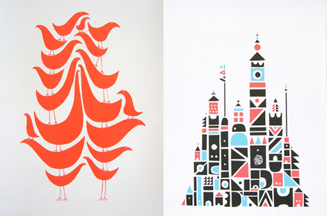
http://grainedit.com/wp-content/uploads/2008/04/wayne_pate.jpg 
SHAPE:
This shows shape because all of the curved lines put together create an image, and there are different lines and curved lines that make up something also. The curved line make up small birds that are somewhat abstract. In the other picture, the small shapes make up a little town full of buildings.

http://www.aaps.k12.mi.us/lakewood.leonardp/files/dsc00226_edited-1.jpg 
LINE:
In this image it is basically all lines. Some of them are vertical and some are horizontal which make it more interesting to look at. If they were all horizontal or all vertical it would be boring. The lines also makes some sort of illusion when you really look at it. I like that fact that they aren't all perfectly straight lines and somewhat curved. 

http://farm2.static.flickr.com/1143/533240359_d17b299f38.jpg 
VALUE: 
In this photo the value shows parts of the image that are light in dark. He is a soldier and the darker shading makes the image more interesting because its a dark photo about war. They used light and dark value in this painting and the lighter areas highlight certain points that pop out to the eye. 

http://photography.nationalgeographic.com/staticfiles/NGS/Shared/StaticFiles/Photography/Images/Content/cottonwood-tree-bark-734162-ga.jpg
 TEXTURE:
This image shows texture because just by looking at it you can see how that tree feels if you were to touch it. The bark would be rough and sharp. The picture does a good job at capturing this because it is so close up and make you think about how it would feel. The artist is trying to convey how that tree would feel if you were to run your hand along it by showing you in a picture. 

https://www.msu.edu/~stankoni/projects/webquest/line.jpg 
SPACE:
in this image space is show around the woman's face. It leaves extra room for the black that makes you wonder. The space show in this image is negative space because it is around the image being shown. The black makes her face pop even more.

Friday, September 9, 2011

Journal week 4

1. Why/how can icons be used to communicate?
Icons can help us with a general idea of what someone is trying to say, even if someone speaks a different language. 


2.Via the internet, find 2 examples of common icons that clearly communicate their message. Post both in this entry. 


stock-vector-vector-illustration-of-handicap-icon-32156185.jpg
The handicap signal helps you know that these people are impaired and are in a wheel chair or have a disability. 
no-parking.jpg
The no parking signal is in red and black letters and is very bold so it gets your attention that you can't park in that area. 

3. What is the difference between copyright and public domain?
Copy right means it's owned by someone, but in public domain it isnt owned at all. It's for the public. 

4. How can you avoid plagairism in this class? In other classes?
Use the information as guidance not for the whole paper and put things into your own words 

Friday, September 2, 2011

Review week 3


What is OSHA? What do the letters stand for?
OSHA helps emloyees reduce the job injuries, illness and deaths. OCCUPATIONAL AND SAFETY AND HEALTH ACT

How can graphic designers effectively communicate? In your own words, explain the communication process.
Through text and vision

Understanding the history, culture and movements of fine and graphic arts will make you a better producer of visual messages. Why?
So when you're designing something you have a broader prospect on things and you have more information. 

Postcast #1 elements of design


Podcast #1 Elements of Design (kellie Stofko)
Watch the podcast. Answer the review questions below. Keep the question italicized and the answer regular.

What does it take to create good graphic design?
Understanding of graphic deisgn

What is the difference between elements and principles?
Prinviblrd- tell us how we should organize those elements. Elements- components or parts, which can be isolated in any viual disign

Name the six (6) elements of design.
Line, shape or form, space, texture, value, color,

What can lines aid in, when alone or combined with  other lines or shapes?
Readablity, appearance, and message of a disgn

Which lines suggest a feeling of rest? Why do you think?
Horizontal

Vertical lines communicate a feeling of what? Why do you think?
Loftiness, because they are over powering

What lines suggest a feeling of movement? Why do you think?
Diagnal line, because theyre going down a slope especaly in realtion to graity

Soft, shallow curved lines suggest what? Why do you think?
Comfort because theyre soft.

These lines suggest confusion and turbulence? Why do you think?
Deep, acute, curves.

What element defines a specific area of space?
Shape

What is the difference between two dimensional shapes and three dimensional shapes?
2D- had width and hight
3D- had depth as well as width and hight.

Describe the difference between geometric shapes and organic shapes?
Geometric shapes are stuctured often symmetrical shapes. Organic shapes are found in nature or can be man made shapes.

What are abstract shapes?
Are stylized or simplified verisions or natural shapes.
Which basic shape projects an attitude of honesty or equality?
square

What do triangles suggest?
Action, or stablity

Circles convey feelings of what?
Protection or infinity

Describe positive space and negative space?

Negative- refers to the shapes around and between the objects and elements. White spaces; gives a place for the eyes to rest, a break in the content
Postitive- refers to the object and elements used in a design, te are which contains all of the elemts you have added to your design. (text, photos, lines etc)

What is texture?
Can refer to the actual surface of a design with the reader actually being able to the feel the texture of the paper and materials. Also implied by layer of richness to add depth.
Incorporating texture into a design can help do what?


What is value?
Is the degree of ligh and dark in a design. It is the contrast between black and white and all the tones in between

What is another name for value?
tone

What can the element of color do when incorporated into a design?
Can convey moods, create images, attract attention, and identify objects.
Intro goals

I took this class because a lot of people last year were talking about it and said it's a class everyone should take. I also want to get more familiar with everything on the computer and learn how to create things digitally. My goals are to create something that's really impressive on the computer. I also want to be successful on the mac computer.